
bro-NEE-swahv KOOZ-kah
On the Identity of Bronisław Kózka
The first identity was designed in the early 2000s by Melbourne designer Dominic Hofstede. It was a strong, era-appropriate piece of work: dark blue type, the surname KOZKA set in clean capitals, and a single orange graphic element riding above the O. The acute accent, the ó, lifted out of the letterform and made into a mark in its own right. It appeared on my letterheads and comp slips, on the back of correspondence, a small declaration of difference. The choice was deliberate. The accent was not incidental to my name; it was its most particular feature, the visible sign of a Polish name navigating an Anglo world. Dominic understood that and made it the focal point.

Over the years, as it often does, the identity softened and simplified in practice. My full first name retreated. Bronisław became Bronek. The diacritics were left behind.
In recent years that has reversed. The full name, Bronisław, with its crossed Ł, its particular weight and cadence, has come back into use, on purpose and with intention. The ł is not an inconvenience to be accommodated; it is a letter, complete and specific, and it belongs to my name. The re-embrace of Bronisław has been part of a broader reckoning with what my practice is, who it is for, and how it presents itself to the world.
For those unfamiliar with Polish, the name sounds like this: bro-NEE-swahv KOOZ-kah. The stress falls on the second-to-last syllable, as it does throughout the Polish language. The ł, which looks like a crossed L, is pronounced as an English W, so Bronisław ends in swahv, not slaw. The ó in Kózka is a long oo sound, as in boot. It is not a difficult name once you have heard it. And the letters, once you know them, are precise instruments, not decorative flourishes.
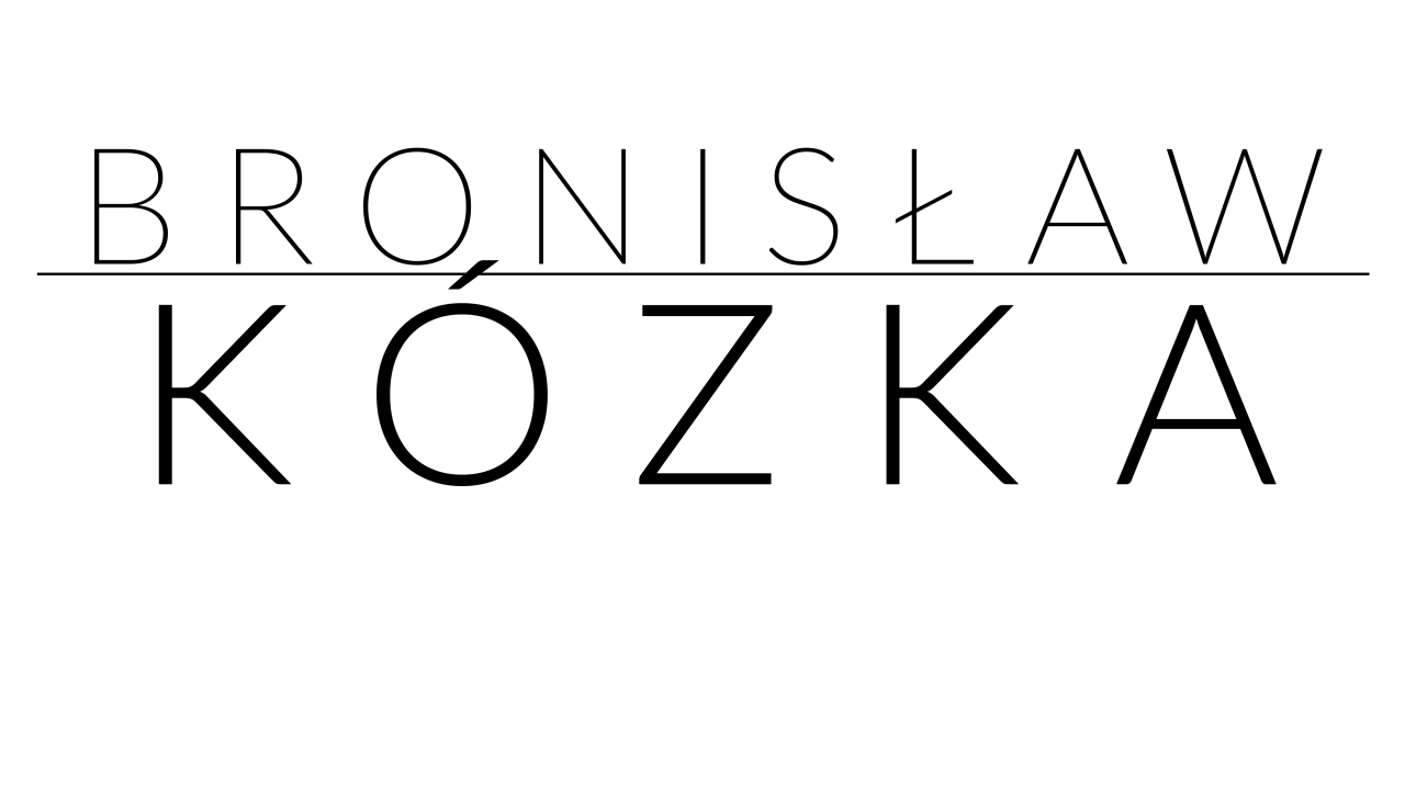
The new website identity at kozka.com takes that spirit and strips it back further. The logo is purely typographic: two weights of Lato, set in black on white, nothing else. BRONISŁAW in Thin, tracking wide, held above a hairline rule. KÓZKA in Light, large, dominant. The ó is there, properly formed, and so is the ł. No graphic embellishment is needed. The letters carry the name.
The choice of Lato matters to me. It was designed in Warsaw in the summer of 2010 by Łukasz Dziedzic, a Polish type designer working under his foundry tyPoland. Dziedzic went on to produce some of the most commercially successful typefaces in the FontFont catalogue, including FF Clan and FF Good, but Lato became something else: one of the most widely used typefaces in the world, released as open source and distributed through Google Fonts. His design intention was specific. He wanted a face that would be transparent in text but reveal character at display sizes, and at the scale of a logo, that is exactly what it does. The stroke terminals are slightly rounded, quietly humanist, warm without being soft.
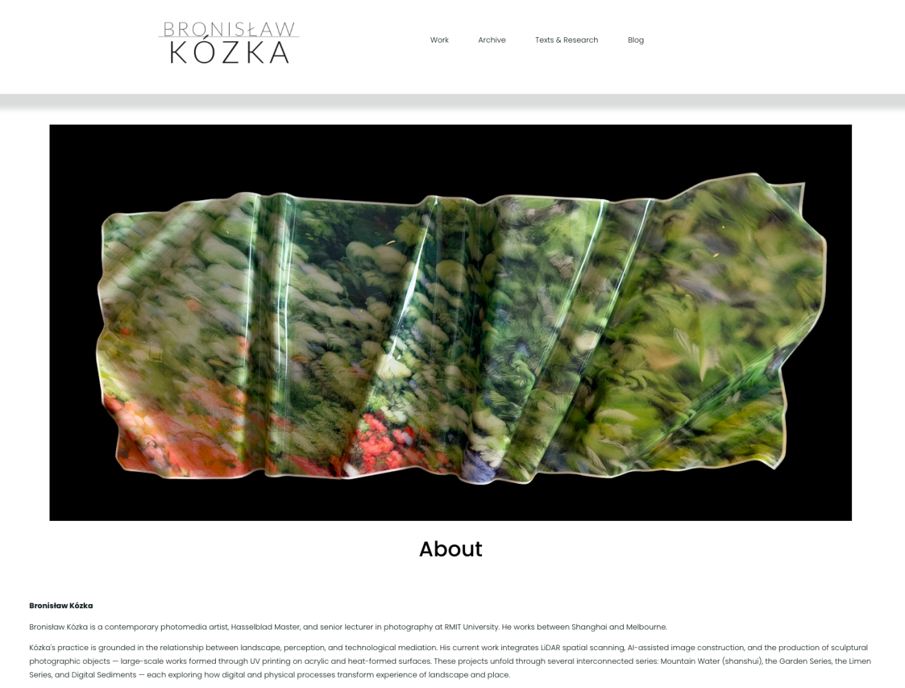
The through-line from Dominic's logo to the new identity is the same instinct: the name, treated with full seriousness. The first time, the accent was orange and conspicuous. This time, it is simply correct, in a typeface designed by a Pole, for a name that is fully, unapologetically Polish.
The website moves to white. Clean type. Work at full scale. Nothing in the way.